I had a great Tasmanian sparkling rosé that I wanted to write something on. Lovely aromatics. Tremendous mouthfeel. Killer value. Definitely a bottle worth spreading the word about.

So I went to the producer’s website to start researching for a post.
Pretty site, lots of lovely pictures. The bottles moved when I hovered the mouse over them. I found the Méthode Tasmanoise tab charming. Clearly, the winery spent a bit of money and thought to put this together.
But that charm and my enthusiasm for writing about their wine got zapped when I came to its product page.
Now I know that many winery websites are designed with Direct-to-Consumer sales in mind instead of wine writers’ research. I get that. So I expect to see the “nitty gritty” details I crave (blend composition, vineyard sources, aging, dosage, case production, etc.) buried beneath the fold. Or maybe hidden away in a trade section.
But I didn’t quite expect this.
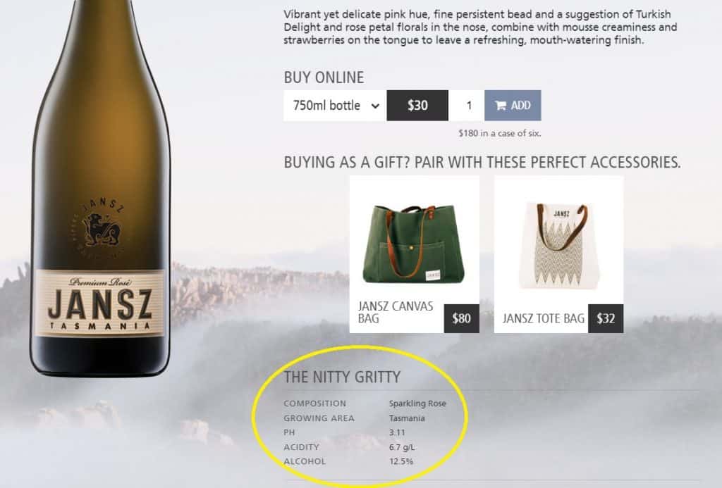
Side note: The gift bag marketing on the product page is very clever.
Wait.
You’re going to tell me what the pH and acidity specs are even though few wine writers and hardly any consumers care about them. But the best answer you’re going to give me about the grape composition is…. sparkling rosé?
Really?

I wonder if, at my next WSET tasting exam, I can get away with identifying the composition of the red wines as “red wine.”
I highly doubt this is some top-secret proprietary blend. Even if you don’t want to give the exact percentages because they change often, it shouldn’t be that difficult for someone to find out if this 12.5% ABV sparkling wine with a 3.11 pH and 6.7 g/l acidity has Pinot noir and Chardonnay.
I suppose I could email the winery or tag them on social media to ask what’s in their wine. Maybe I’ll get a reply? Or not.
But that still begs the question of why in the world do so many wineries make it hard for somms, retailers and wine writers to find meaningful information about their stories and products? Why is this an area where wineries regularly drop the ball when it comes to helping folks sell and talk about their wines?
Above the Fold – Entice
A winery’s website serves two audiences. Consumers and the communicators who are going to be presenting your wines to those consumers.
I haven’t seen any good traffic studies on who is more likely to visit a winery’s website. It very well may be industry folks and writers. But the smart move is to always keep the consumer (and what they’re thinking) front and center. That means making sure that the “above the fold” content of a page is enticing as numerous scroll map studies have shown that website visitors are not likely to scroll further down the page.
Unless, of course, they’re looking for something. But more on that later.
Here is where I think the Jansz page does a decent job. The tasting note is not too jargon-driven, using words that consumers respond to such as “vibrant” and “mouthwatering.” As I mentioned above, I think the gift bag suggestion is an excellent idea for add-ons.
Even world-renown wine regions that are monovarietal will get the “What’s in it?” question from consumers who are not geeks or connoisseurs.
For a lot of consumers, this is perfect. But some will want a little more detail. Maybe stuff like, oh I don’t know, grape composition?
What’s in it?
When I was on the sales floor, this was always the question I got asked the most. No one asked me about pH, acidity, yields, harvest dates or trellising.
Occasionally, folks would want to know if the wine was “natural”, vegan or “green-friendly.” The “butteriness” of Chardonnay would come up for customers who loved or hated that style. Sometimes I would get general questions about how oaky a wine was or if it was sweet. But, even then, I never had a consumer expect me to give them exact oak aging and residual sugar details.
Often consumers wouldn’t ask any questions whatsoever and were happy with just a strong recommendation that the wine was worth trying. But that didn’t mean that I didn’t still have questions that would send me to a winery’s website for answers.
Below the Fold – Educate
What kind of “nitty-gritty” info should you have on your site for the folks who really want to learn more about your wines?
A lot of that will depend on if you want everything on the consumer page or in a separate trade/tech sheet section. If it’s the former, you still want to keep the page focused on enticement and driving home why this wine is worth your attention. Again, details like pH and TA are great for geeks, but most consumers aren’t going to care.

Seriously, I only had one customer ever ask me what the pH of a wine was. That was because he just had veneers put on and his dentist told him not to have any beverages with a pH less than 3.
One example I like is from Arlo Vintners in Victoria with what sounds like a fascinating white field blend.
In a few brief paragraphs, this product page tells me:
What’s in it.
Where the fruit comes from and why this is unique/interesting.
How it was made (co-fermented, ambient yeast, tank, no acidification, unfiltered).
The biggest things missing are details about how the vineyard is farmed–i.e. organic, sustainable, biodynamic, etc. This is definitely an area that consumers are asking more questions and becoming increasingly mindful about.
Tech Sheets/Trade Sections
Personally, I think every winery website should have a trade section. When I worked in the industry, it was always the first thing I looked for and, as a writer, my heart still drops when I visit a website without one.
Selling wine is like big game hunting. The ammo you use matters. For the somms, wine stewards and writers looking for more info about your wine, here is where you’re either going to properly equip or send them on their way with Nerf darts.
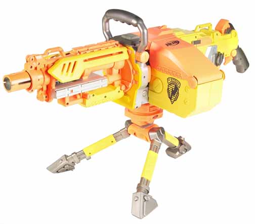
The Nerf Strike Vulcan aka a fancy, expensive winery website that offers little to no useful info about a wine.
This is the section to geek out with nitty-gritty technical specs but keep in mind that those are “low caliber” details. They’re not going to bag a sale on their own.
You need high caliber equipment to really nab the prize. Few things pack a punch like personal story tidbits.
And you can slip this powerful ammo into a tech sheet.
A perfect example comes from the vineyard details that Pedroncelli provides with their tech sheet for the Courage Zinfandel.
Dave and Dena Faloni are the neighbors behind Courage Zinfandel, a three-generation grape-growing family located two miles west of the winery. While most Zinfandel in the valley is head-pruned, Dave has trained his vines on a trellis. He knows every quirk of the soil and every vine on their 24 acres having farmed it all of his life.
I love that line “… the neighbors behind Courage Zinfandel” and how it invokes the picture of neighbors and families working together to make something that a consumer would want to share with their family. Great personal connection. The other lines also add personality that makes this Zin feel different and distinct from all the other Zins competing for attention.
Likewise, I also love how Ramey drops several details in a tech sheet about how their Napa Valley Claret is different from its many, many peers.
10% Russian River fruit. (Remember, AVAs are only 85%)
8% Syrah.
12 months lees aging with monthly bâtonnage.
How cool is that?
If you take me back to my sales floor days with a customer asking why they should get this $35-50 Napa wine over other $35-50 Napa wines, this is the type of stuff that I’m going to be telling them–along with my personal recommendation of how delicious the wine is.
Knowing these details gives communicators ammo to highlight the unique and interesting points that make a wine worth paying attention to. So why not give it to them?
Here’s one more.
While I would like a little more “ammo” from an enticement perspective, I’m impressed with the technical design of how Juniper Estate in the Margaret River incorporates their tasting notes on their product pages.
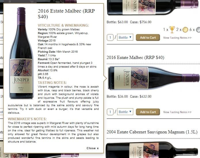
Next to each bottle is a link to view tasting notes as a popup window. No need to click around and visit multiple pages to learn about different wines.
That’s a lot of nitty-gritty info packed into a small space. But it’s done in a fairly elegant and unobtrusive way. Many wineries would be wise to imitate this design.
The Bottom Line
The people who visit your website came to your site for a reason. There was something about your wine that captured their attention and here is where you are either going to foster that intrigue or lose it completely.
A well-designed and functional website is a critical piece that shouldn’t be overlooked. It affects not only consumers and potential DtC sales, but it profoundly impacts what kind of tools you’re giving sommeliers, retailers and writers to sell and talk about your wine.
The ball is in your court. Go to your website and take a look at your armory. Is it well stocked with useful and meaningful tidbits that entice, excite and inspire folks to want to learn more?
Or is the room mostly empty except for some scattered Nerf darts?