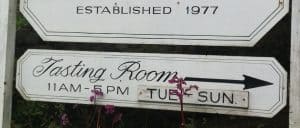
I’m wrapping up my Northern California jaunt with a lovely 4-hour flight delay at SFO. But, all in all, the trip was extremely productive. I was able to gather lots of inspiration for future posts that I’ll be publishing over the next couple of months.

You can get a sneak peek at some of the places I’ve visited and topic ideas that I’m mulling over on the SpitBucket Instagram page.
I had several objectives on this trip–researching the Stags Leap District for a special project, indulging my wife’s sparkling wine obsession, checking out the CellarPass winery reservation system and figuring out how California’s prestige wine regions plan to reach Millennial consumers.
When it comes to the latter, the jury is still out. But I can tell you one thing, many wineries certainly won’t be helped by their signage.
I Can’t Drive (Or Read Your Sign) 55!

I seriously can’t believe that Sammy is 71.
And, at 71, Sammy Hagar probably can’t read them either–at whatever speed he’s driving nowadays.
It was really surprising how many winery signs along the major roadways in Napa and Sonoma had tiny print for their tasting hours and whether or not they were by appointment.
Sometimes even the name of the winery itself was hard to read because they decided to mimic the cursive font on their label. Very elegant when you’re slowly pulling into their entrance but completely useless when you’re whizzing past on California 12 in Carneros at 55 mph (or 65 mph as the numerous cars that passed me were going).
Now it’s not that bad when you have a passenger with a smartphone that can Google to see what winery we just passed and if it’s worth turning around to visit.
But that’s not good either.

Not elegant but effective–especially at 55 mph.
At several of the wineries I visited, I chatted with my fellow guests to see where they were going next. The most common reply I heard from wine drinkers of all generations was:
“Oh, we’re just going to drive around and see what jumps out.”
Do you think the winery signs with hard to read cursive fonts and tiny print “jump out” to many of these drinkers?
I truly wonder how many winery owners have gotten into their cars and drove past their signs at the maximum (and “realistic”) speeds to see how readable they are.
This is particularly critical for small wineries that don’t necessarily have people looking for them. They really need to capitalize on those wine drinkers who are just driving around and looking for a place to visit.
It’s worth sacrificing a little bit of elegance to gain functionality.
And that is the point of a winery sign, isn’t it? To be functional and to help people find you.
A good sign doesn’t have to look like a highway sign but taking a look at their standards is not a bad idea.
At the bare minimum, the name of the winery should be crystal clear as well as the tasting hours and if appointments are required or not. And this needs to be readable at roadway speeds.
Because most consumers aren’t going to pull over or ask a passenger to whip out their smartphone to see if a winery is worth turning back for.
They’re just going to keep on driving, looking for something to “jump out”.
